
Insights provide a visual representation of your help desk data. Use the interactive charts to identify where to focus your QA efforts, uncover blind spots, and find the right agents to review based on their performance.
This article contains the following topics:
Accessing the Insights view
The Insights view for conversations provides two main charts that offer an overview of your help desk activity over different time periods (last 30 days, last month, last seven days, or last week).
To access the Insights view
- In Quality Assurance, click
 Conversations in the sidebar.
 - Click the Sidebar toggle icon (
 ) to display the side menu.
 - Click Insights.
- Select a time period from the tabs at the top – the default is Last 30 days.
- Select or deselect the filters to customize what is displayed in the charts.
- (Optional) Click and hold the filter box, then drag it up or down to change its position in the list.
Interacting with the Insights charts
The Insights view displays two interconnected charts: the Conversations and the Agents chart.
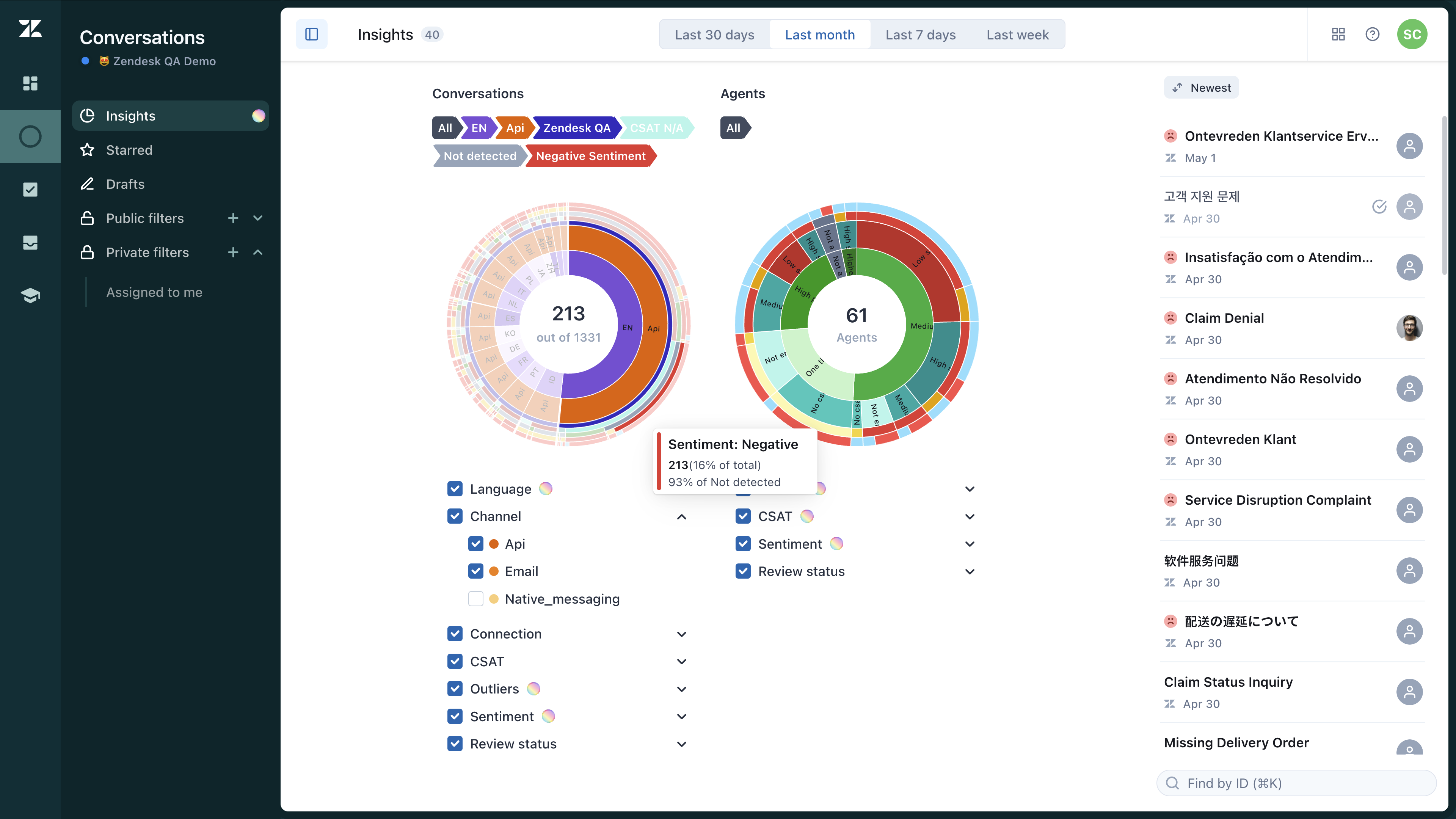
Conversations chart: Breaks down your help desk conversations by the following filters:
- Review status (reviewed or not reviewed conversation)
- Language
- Connection
- Channel
- CSAT
- Outliers
- Sentiment
Click on any filter area to view and review those conversations
Agents chart: Breaks down which support agents replied to different types of conversations. This chart also includes filter layers displaying these agent performance metrics:
Click on low-performing agents to view their conversations.
The charts are divided into multiple filter layers, all selected by default, so the initial chart displays data for all filters. You can deselect any filters you don’t need and select only those you want to see—such as channels or specific languages—to view data for those layers only.
Read the chart from the center outward, with each concentric circle representing a deeper level of detail.
Hover over each ring layer in the chart to access an overview of the data. Click any filter layer to explore the data further. Your selections will be displayed above the charts.
You can also rearrange the order of the rings by clicking and holding each filter box, then dragging it up or down in the list. This lets you change your perspective and zoom into the data attributes that matter most to you.
For example, if you’re looking for English conversations to review, move the Review status and Language filters to the top of the list, then click into the Non-reviewed and English sections.
Once you’ve made a selection, the corresponding conversations appear on the right side of the page for consultation or review.
Because both charts are interconnected, any selections you make on one chart will update the other and refresh your conversations list.
To reset the charts and undo any zoomed-in layers, check the middle section of each chart.
0 comments
Please sign in to leave a comment.